Correlation & Regression
- A-Level Maths

- Sep 7, 2020
- 2 min read
Updated: Dec 7, 2020
Bivariate data is data with two variables, and can be represented in a scatter diagram. We can describe the correlation between the two variables based on how much of a straight line the points on the diagram form.
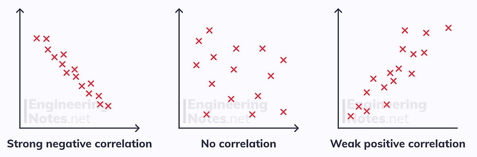
Correlation describes the nature of the linear relationship between two variables.
A negative correlation occurs when one variable increases as the other decreases.
A positive correlation occurs when both variables increase together.
Causation
The relationship can be described as causal if a change in one variable induces a change in the other. It is vital to remember that just because there may be a correlation, no matter how strong, between two variables, it does not mean the relationship is causal.
Correlation does not imply causation
You need to consider the context of the variables and use common sense to decide whether or not there is causation as well as correlation.
Measuring Correlation
The product moment coefficient, r, is a measure of strength for linear correlation between two variables. It takes values from -1 to 1, where
If r = 1 the correlation is perfect and positive
If r = 0 there is no correlation at all
If r = -1 the correlation is perfect and negative
You calculate the product moment coefficient using a stats-equipped scientific calculator.
On a CASIO ClassWiz fx-991EX, to calculate the product moment coefficient, r:
Click MENU
Click 6: statistics
Click 2: y=a+bx
Input your data in the table
Click AC
Click OPTN
Click 3: Regression Calc
r is the product moment coefficient
Linear Regression
The line of best fit on a scatter diagram approximates the relationship between the variables. The most accurate form of line of best fit is the least squares regression line, which minimises the sum of the squares of the distances from each data point to the line.
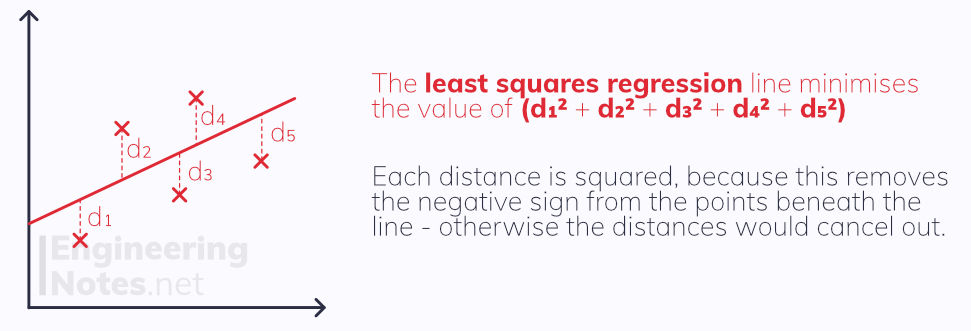
The regression line is plotted in the form y = a + bx
Where b tells you the change in y for each unit change in x.
If the correlation is positive, so is b, and vice versa.
To calculate a and b, use your calculator and follow the steps above for the product moment coefficient.
Independent & Dependent Variables
The independent variable is the one that is being changed, the dependent variable is the one being measured and recorded.
The independent variable should always be plotted on the x-axis
The dependent variable should always be plotted on the y-axis
You should only ever use the regression line to make predictions for the dependent variable
Exponential Models
Exponentials and logarithms can be used to model non-linear data that still has a clear pattern.
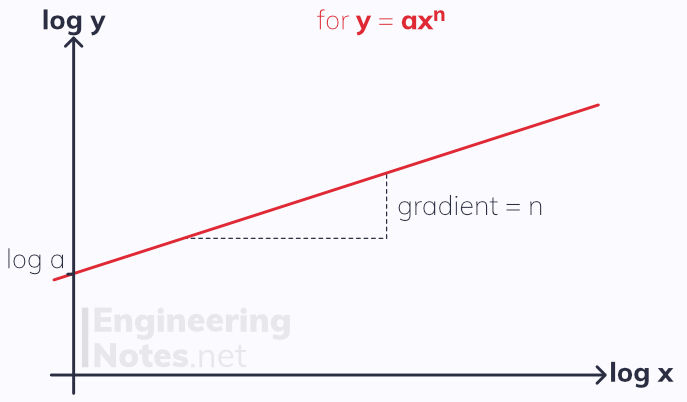
If the equation is in the form y = axⁿ, a graph of log(y) against log(x) will give a straight line where log(a) is the y intercept and n the gradient.
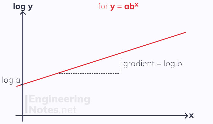
If the equation is in the form y = ab^x, a graph of log(y) against x will give a straight line where log a is the y intercept and log b the gradient.


Comments